Week 10 Standout Viz – Percent of Total
What is Percent of Total?
Percent of Total is a simple yet powerful calculation that shows how much a specific part contributes to a whole. It’s often used to visualize proportions, whether that’s market share, population segments, budget allocations, or, in this case, public concerns.
Instead of showing just raw numbers or absolute percentages, this method highlights relative weight, perfect for comparing how different issues rank in people's minds over time.
The Dataset Inspiration
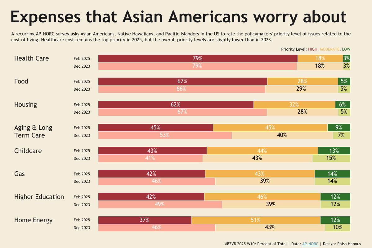
This week’s challenge draws from a survey conducted during Asian Americans, Native Hawaiians, and Pacific Islanders (AANHPI) Heritage Month, where respondents rated how much of a policy priority certain cost-of-living topics are, such as healthcare, housing, food, gas, and childcare. The data includes:
Issue – e.g., Housing, Healthcare, Groceries
Survey Date – either Dec 2023 or Feb 2025
Priority Level – High / Medium / Low
% of Respondents – How many assigned that priority level to each issue
The data helps us understand:
What expenses are most concerning
How sentiment has changed over time
Which categories shifted in priority
Standout Viz of the Week: Raisa Hannus' Expenses that Asian Americans worry about
Click here to view the dashboard on Tableau Public
Raisa Hannus delivers a polished, side-by-side bar chart comparison showing the priority breakdown for each issue across two time periods (Feb 2025 and Dec 2023).
Why it Stands Out
Dual Period Comparison: Each issue is visualized across both 2023 and 2025, letting users spot shifts at a glance.
Color & Consistency: High priority (red), Moderate (orange), and Low (green) are consistently applied. The use of bold red pulls your eyes straight to the most important data.
Clean Labeling: Text and tooltips add clarity without clutter. You always know what % you're looking at, and for what priority level.
Minimal Yet Impactful: It avoids unnecessary chartjunk. Clean white space, equal row height, and subtle outlines make it highly scannable.
Call-to-Action Title: “Expenses that Asian Americans Worry About” clearly defines the subject, making it accessible to a broad audience.
Tooltip that Tells a Story: Bold, headline-style tooltips that instantly grab attention and distill key insights in a glance

Want to Learn Percent of Total?
Here are a few helpful resources to get you started with Percent of Total:
Follow Us & Explore More
Follow Back 2 Viz Basics
Join the conversation on Twitter and LinkedIn using #B2VB