2026: Week 1 Standout Viz – Build a Bar Chart
What is a Bar Chart?
The Bar Chart is arguably the most essential foundational visualization. Bar charts are the gold standard for comparison because they leverage our natural ability to perceive differences in length, making complex rankings intuitive at a single glance. Mastering this basic chart is crucial, as it forms the foundation for many other visualization types.
For Week 1 of the 2026 Back 2 Viz Basics (#B2VB) challenge, we are returning to the foundation: Build a Bar Chart. The goal is to compare values across different categories clearly and effectively, showing how compelling a simple visualization can be.
This week, we are diving into the WEF Youth Pulse 2026 report data. The World Economic Forum surveyed Global Shapers to understand which economic shifts they believe will define their future. The data reveals a clear split between concerns over stability and the rise of new, flexible ways of working.
The key data fields for this week are:
Economic Trend: The specific trend identified.
Trend Sentiment: Whether the trend is categorized as Negative or Positive.
Selection %: The percentage of respondents who selected this as a top-three trend.
Standout Viz of the Week
We were blown away by the quality of submissions this week! It was impossible to select just one, so we are featuring two standout authors whose work exemplifies best practices for the humble but mighty bar chart.
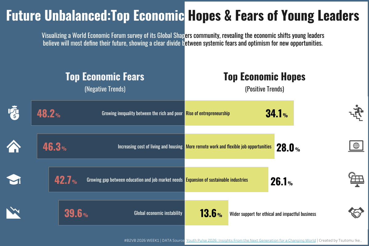
Standout Viz of the Week (1) : Tsutomu Ikeda’s Top Economic Hope and Fears of Young Leaders
Click here to view the dashboard on Tableau Public
Tsutomi Ikeda's submission brilliantly tackles the Week 1 challenge, demonstrating how a simple bar chart can be used to convey the nuanced findings of the WEF Youth Pulse 2026 report.
Why it Stands Out
This dashboard nails several elements that make a viz not just good, but great:
Unique Structure: The Butterfly Bar Chart: Tsutomi’s use of a butterfly chart (also called a diverging bar chart) is outstanding. This design choice is perfect for this dataset because it clearly and neatly separates the "fears" (negative sentiment) from the "hopes" (positive sentiment) on either side of a central axis, making the comparison instantly effective.
Impactful Icons for Clarity: The inclusion of simple, clear icons next to each trend name enhances comprehension. This design element makes the list of categories more engaging and helps the reader quickly identify the topics.
Clean Layout: The layout is neat and highly readable. It successfully avoids visual clutter, which helps direct the viewer's focus immediately to the core findings.
Thoughtful Color Use: The balanced color palette is well-chosen and neat. Color is used strategically to reinforce the separation of positive and negative sentiments established by the butterfly chart structure.
Overall Presentation: Tsutomi's work sets a high standard by using an advanced bar chart variation to present a complex dataset in a simple, highly effective manner.
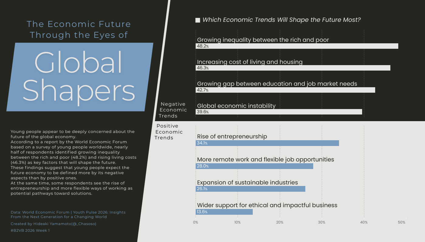
Standout Viz of the Week (2) : Hideaki Yamamoto’s The Economic Future Through the Eyes of Global Shapers
Click here to view the dashboard on Tableau Public
Hideaki Yamamoto, known as @_Chasoso on Tableau Public, also takes the spotlight this week. His exceptionally thoughtful visualization also uses the WEF Youth Pulse 2026 data to explore what Global Shapers believe will shape the economic future.
Why it Stands Out
This dashboard nails several elements that make a viz not just good, but great:
Clarity Feature: Extra Notes for Context: Hideaki excels at guiding the audience with extra notes for clarity (like annotations or key takeaways). These notes ensure the audience understands the most important findings and the hierarchy of economic hopes and fears without needing to search for context.
Strategic Color-Coding: The visualization is overall beautiful and uses color strategically to highlight the positive and negative sentiments. This helps the audience immediately categorize the trends and reinforces the story in the data.
Intuitive Layout: The sleek, breathable design is easy to navigate. It creates a seamless experience that allows users to explore both the overview and the granular details within a single, elegant view.
Overall Presentation: Hideaki’s viz provides an extremely polished and engaging dashboard, demonstrating how to provide clarity and context alongside the visual data.
Here are a few helpful resources to get you started with Bar Chart:
Follow Us & Explore More
Follow Back 2 Viz Basics
Join the conversation on Twitter and LinkedIn using #B2VB