2026: Week 3 Standout Viz – Build Dot Plot
What is a Dot Plot?
A dot plot is a powerful chart type used to compare values across categories using position along a shared scale. Because it relies on alignment rather than heavy visual elements, it makes differences, gaps, and rankings easy to interpret.
Dot plots are especially effective when comparing two values within the same category — helping viewers immediately see which is higher and by how much.
About the Data
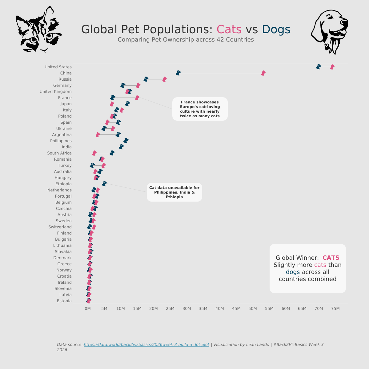
For Week 3, the dataset explored pet populations (Cats and Dogs) across 42 countries.
Participants were challenged to use a dot plot to compare pet ownership between cats and dogs and highlight patterns across countries.
and highlight patterns across countries.
Data fields:
Country: The name of the country
Flag Code: Country flag identifier
Pets: Type of pet (Cats or Dogs)
Population: Number of pets
Standout Viz of the Week: Leah Lando’s Pet Ownership Stats
Leah’s visualization, “Global Pet Populations: Cats vs Dogs”, takes a creative and polished approach to comparison. The design is both informative and visually engaging, making it easy to explore patterns across all 42 countries.
Click here to view the dashboard on Tableau Public
Why it Stands Out
This dashboard nails several elements that make a viz not just good, but great:
Creative Use of Icons as Data Marks: Instead of traditional circular dots, Leah uses cat and dog icons as the data points. This small but thoughtful choice enhances the theme without sacrificing clarity. The icons remain aligned to the same axis, preserving the integrity of the dot plot while adding personality.
Strategic Color Differentiation: The color choices clearly distinguish cats and dogs, making comparisons immediate and intuitive. The palette is soft yet distinct, helping viewers instantly recognize categories without overwhelming the visual.
Clean and Breathable Layout: The spacing throughout the dashboard is intentional and balanced. Countries are clearly listed, the axis is easy to read, and annotations are placed thoughtfully. Nothing feels cramped. The generous white space makes the entire view easy on the eyes.
Clear Context Through Annotations: Subtle callouts, such as highlighting France’s cat population and noting missing cat data for specific countries, add clarity and storytelling without cluttering the chart. These details guide the viewer’s understanding naturally.
Polished Overall Presentation: From the large, friendly title to the subtle summary insight (“Global Winner: Cats”), the dashboard feels complete and cohesive. Every design choice supports the comparison.
Here are a few helpful resources to get you started with Dot Plot:
Follow Us & Explore More
Follow Back 2 Viz Basics
Join the conversation on Twitter and LinkedIn using #B2VB