Bar Charts
Let’s build a bar chart, looking at Sales broken down by Category and Sub-Category.
- Click sales, Category, and Sub-category
*Note that for the rest of the articles, I will not use Show Me. I believe it is important to become comfortable with manually building your views so you can practice learning how Tableau builds your views based off what is on the columns and rows shelf.
So here we have a simple bar chart. Let me walk through the different cool things you can do just using this bar chart.

Our bar chart looks pretty good here, but some of these titles are getting cut off. Let’s say I want to swap this around so that I’m looking at it horizontally. We can click this handy swap button that Tableau gives us.

Now we see a much neater bar chart. Tableau is also very “manual” friendly. You can shift the spacing around within the view by hovering near the edges (right below the Sales axis) and clicking to drag it to be taller or shorter.
There’s also something else that we can do to make this more user friendly. Remember, that as developers, one of our jobs is to make sure that our client doesn’t have to spend much time looking for the answer to their questions.
Let’s use a sort. Tableau has very easy sort features: buttons at the top!
- Click descending sort

With our bar chart sorted like this, we can easily see the top performing and bottom performing sub categories within each category.
Now I want a pop of color to really emphasize the different categories. Let’s use our color mark for the first time:
- Drag Category to color card
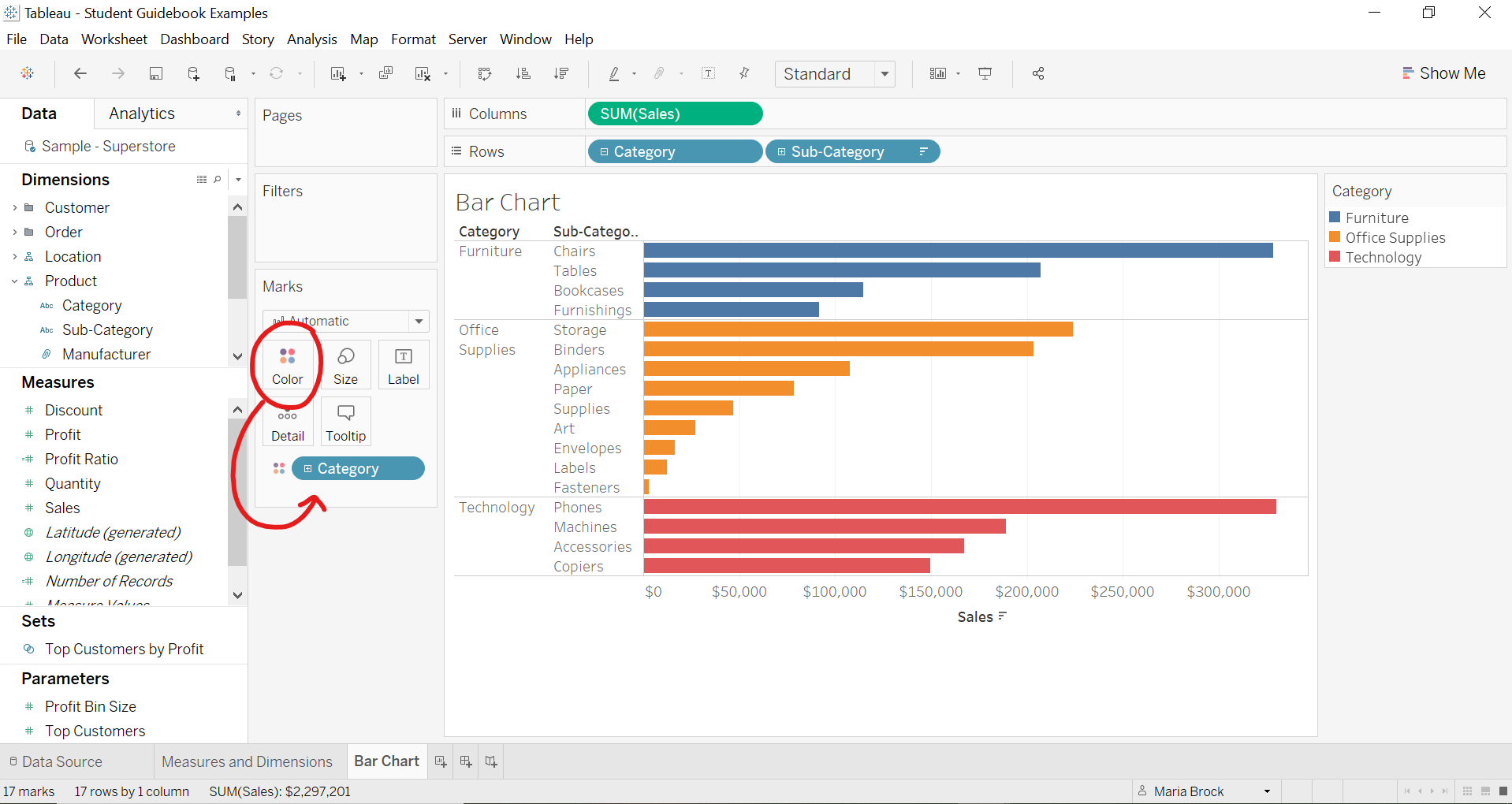
We can also click the color card and click “edit colors” and change the colors around. Tableau gives us extensive color options.
There’s also another way that color can be used to provide more insights. Let’s take Category off Color for right now by clicking and dragging Category off and dropping it back into the Dimensions pane.
So here we have our Sales, but now the Client also wants to see their profits as well.
Now you can double click Profit (or drag it next to Sales on the Columns shelf), and it will create a side by side bar chart.
- Click Profit

This is perfectly fine, and a good example on how to build multiple bar charts in the same view, but remember what we said about wanting to cut down on the time that the client has to go back and forth between the two graphs to try to compare sales and profits. This is where Color can come in.
Let’s drag the Profit off the columns shelf and onto the color card.
- Drag Profit to Color card

Look at that. Now we can really see what category of our sales where we have made negative profit!
Question: I’m your client and I ask you what is costing us money right now? Where are we losing money? What do you say?
We can clearly see that tables, while it has made decent sales, has lost us the most money.
If you click the Color card and Edit Colors you can format what type of colors we want. I’m going to stick with orange-blue because that’s color-blind friendly.
I want to point something out that if you learn now, it will save you a lot of time. Notice how our Color choices here are based off of ranges of colors. This is because we are using a continuous measure (green pill). So for our continuous range, we will have a continuous range of color. Now drag the Profit off the color card and put Category back on. Do you notice how our color format has changed when we go to Edit Colors? Now we can physically choose which color we want for each section. That is because we are now using a discrete dimension (blue pill), so we have to assign the color to each dimension.
*Just a note: when you go to edit discrete colors, you’ll have to click on the item you want to change first on the left, and then select the color on the right. It took me a bit to figure that out.

Profit on Color

Category on Color
Discrete and continuous can be confusing concepts, but the more you practice, the more you’ll become comfortable with it.
Here’s a quick breakdown of discrete vs. continuous:
Green/Continuous means that the values are continuous. When I was born, I weighed 7 pounds and when I was 10 years old I weighed 70 pounds. During that time period, I hit 62.344 and 62.345 and 62.45 etc. It’s a continuous range.
Blue/Discrete means that the values are finite. I can have 5 children, but I cannot have 3.5 children.
Here’s a good link to an understandable breakdown of discrete vs. continuous.