Dates and Line Charts
We can use line charts to visualize changes over time. Your client wants to see how his company’s sales have changed over time.
- Click Sales, Click Order Date

So here we see a very simple line chart that tells us a good thing: that our sales decreased in 2016 but then increased the past 3 years!
*Notice here a few things: Let’s remember what we went over in the Data Source page, about how Tableau automatically assigns data types to each field. Tableau can read your original date data in various forms (Dec 1, 12/1, etc) and assigns them to a specific role as “date value”. Tableau also automatically assigns your date value to be a discrete dimension.
When you first click on your date, Tableau places your dates to the highest order available, which in this case is “Year”. These dates are treated as hierarchies. This means that Tableau orders them as Year, then Quarter, then Month, then Week, etc.
- Click the “Plus” icon next to YEAR(Order Date) etc.
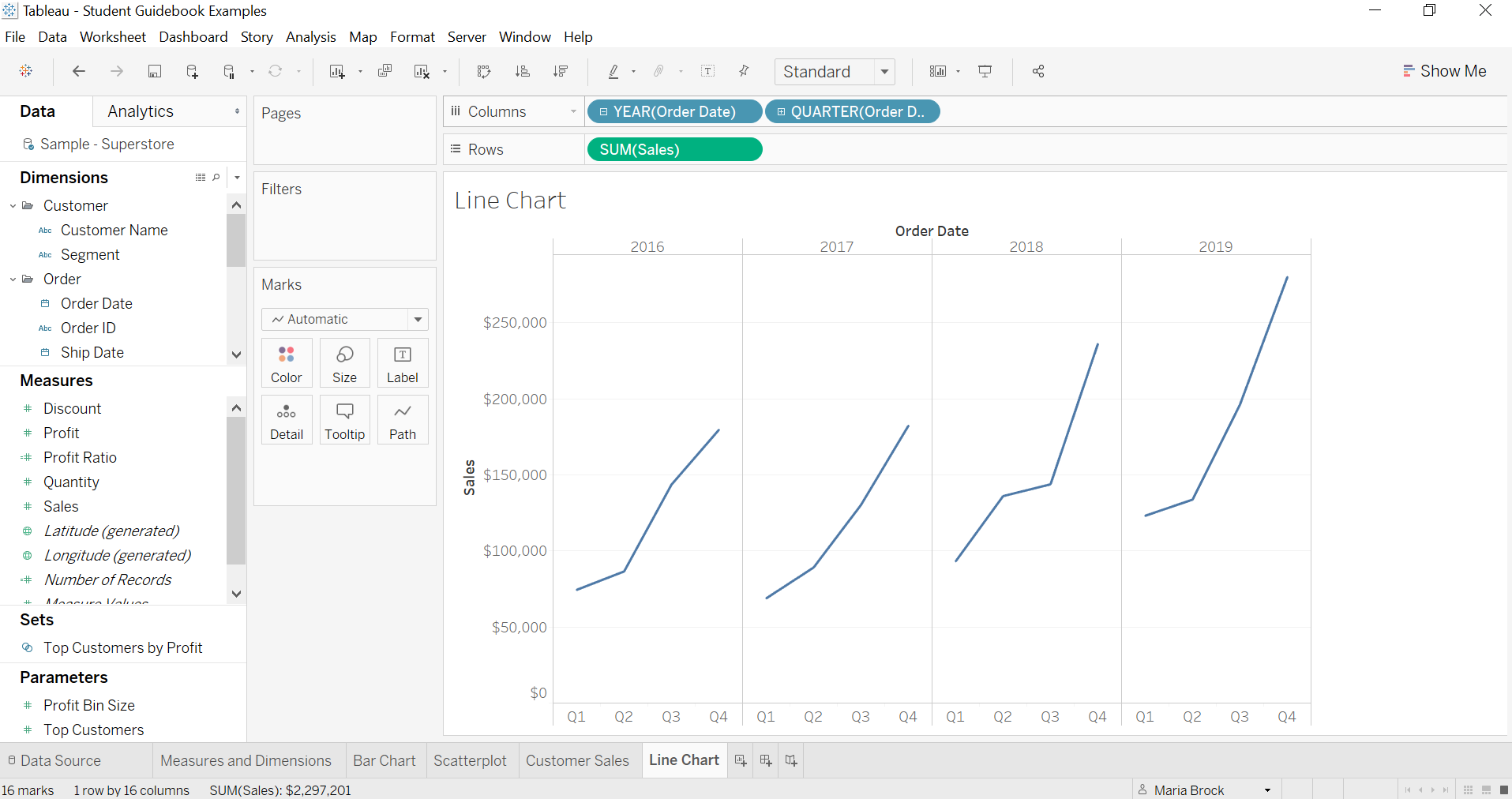
Tableau sections these off because they are discrete dimensions right now. Here you can see every quarter within every year. Let’s click the plus icon on Quarter(Order Date) now. Notice how your view is now split up into each month per quarter per year.
*Note that you may not see all months on the label. That’s just because of sizing, they’re still there.
If you like, you can also drop different details. For example, I don’t want my data split up by quarter, I just want to see months in each year, so I’m going to drag quarter off.
- Drag quarter off

Like I said, Tableau first treats your dates as discrete dimensions. Now this is where it can get a little tricky. You can convert your dates to be discrete or continuous.
What’s the difference between these two? The best way is to show you.
-Drag Year(Order Date) off, leaving only Month(Order Date)

See here: With our Month(Order Date), we have a blue pill which means it’s discrete.
Wait, but we’re only seeing 12 months in the view. What happened to our years? Let’s examine our discrete date here: When we have a discrete date it’s going to show us the date part, aggregated across the values. So this means that we are just seeing 12 months as “categories” across all years. E.g. the sum of all January values, the sum of all February values, etc.
Let’s “de-aggregate” our view by year.
- Drag Year(Order Date) to Color

Here our discrete months, which had been aggregated over all the years, has now been broken up by year categories.
So again to re-iterate, discrete blue date pills mean that you will see just the date part.
Now let’s tackle continuous dates. These are bit easier to understand. If we right click our measure, we can click “month” in the second half. These dates on this menu are separated into two halves: the top is if you want discrete dates, and the bottom is if you want continuous dates.

- Right click Month(Order Date) and choose Month on the second half.
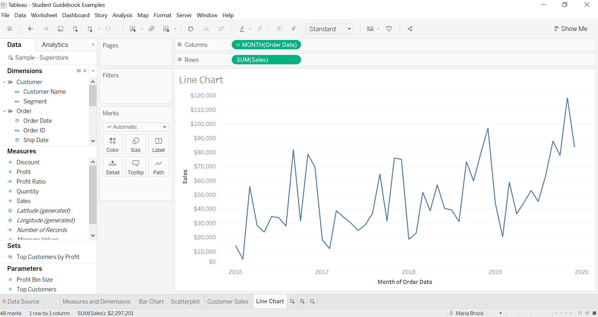
Notice that the Order Date pill changed from blue to green? This is because it changed from a discrete date to a continuous date.
Having continuous months here means that each year will be visible as a unbroken timeline, and our months will be continuously running between years.
If you want to add a little more detail and split up the years, you can add a discrete date to partition them
- Add Year(Order Date) before Month(Order Date)

Notice that this is the same view as having Year(Order Date) and Month(Order Date) as both discrete variables. This just goes to show the multitude of different ways you can create dates and timelines in Tableau.
Dates can be difficult in Tableau. Really, the main thing here is to practice with it. Once you get the difference between discrete and continuous dates, the rest will come easily.